Hey guys, does Folks offer a personally tailored analytics page for your portfolio? I don’t understand why all these defi platforms have such limited UI settings to force users to dig through the blockchain. Ain’t no mass adoption going to touch anything that is not in convenience. Why the unnecessary “minimalist” look for a finance app?
If it already exists and I’m not finding it, could someone please direct me to the source?
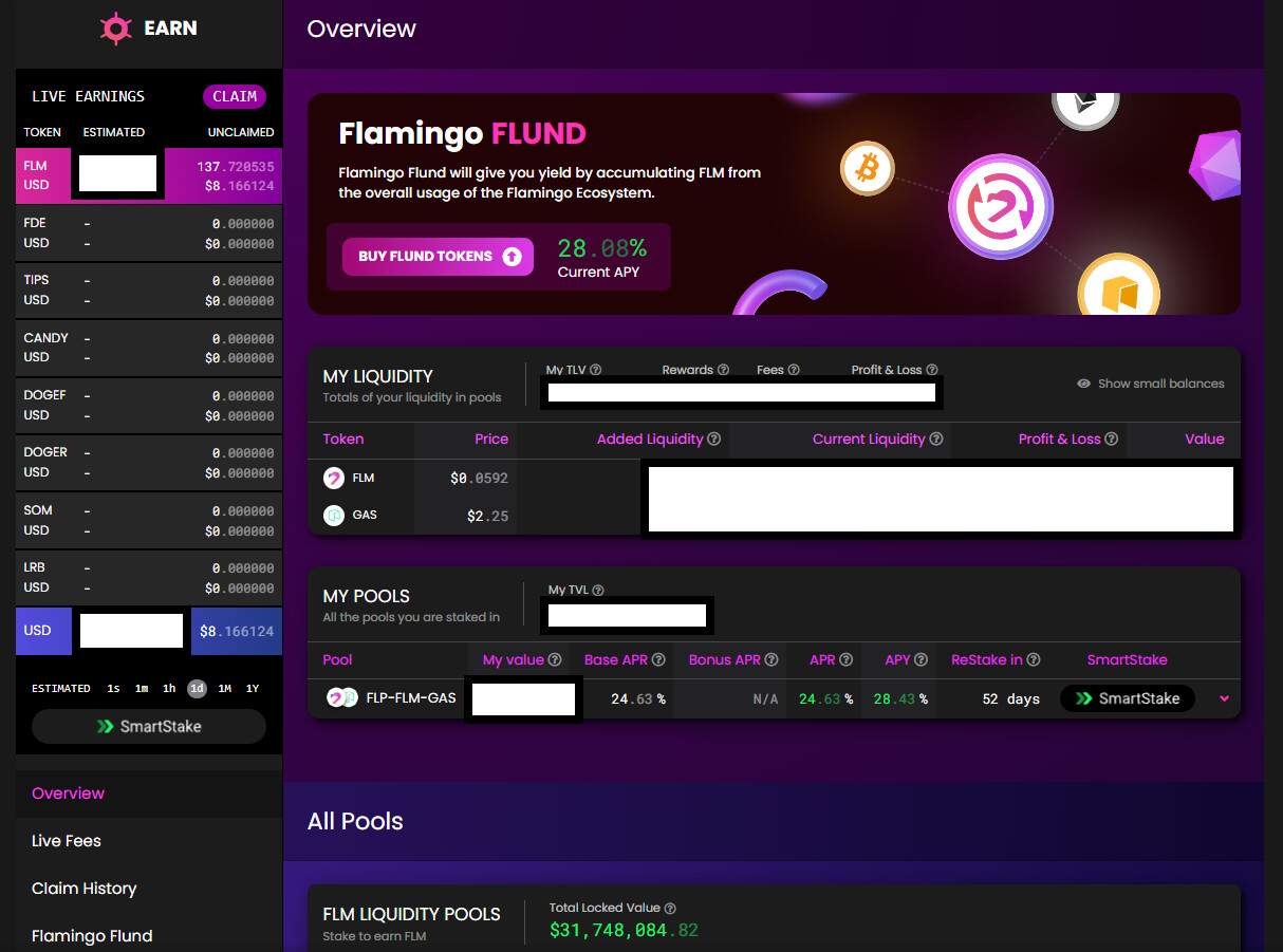
Coming into midterm 2023, Flamingo Finance STILL has the best UI yet! Please make the platform more self-intuitive than us digging through txs via an explorer.
Thank you for your feedback on our platform’s UI. We appreciate your input and understand the importance of a user-friendly interface. Our minimalist design is intended to express our name, Folks Finance, and provide easy navigation for all users, even those who are new to crypto.
Regarding personalized analytics for your portfolio, we are currently working on a similar feature that is still in the early stages of development. We are committed to enhancing our UI and providing the best possible experience for our users. Thank you for your support, and we look forward to exceeding your expectations in the future…
Thanks. I’m simply asking for more efficient ways to better manage my own portfolio like trad fi major banks do (these are the orgs you’re trying to beat right?). I’m certain this would be helpful universally across the platform.
Hope it will be amended here soon as Folks is the BEST defi on Algorand, yet